
Redesign for myEntergy.com
📅 April – December of 2023
🎨 Lead UI designer
💼 Work completed while employed at Mindgrub
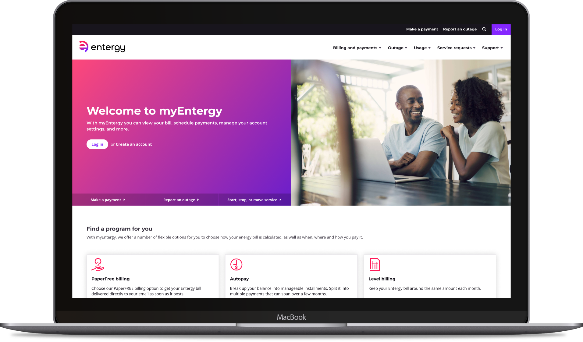
myEntergy.com is a customer-facing website for Entergy, an energy company that provides electricity to over 3 million customers in Arkansas, Louisiana, Mississippi, and Texas.
Through myEntergy.com, customers can perform actions like creating a new account, paying a bill, enrolling in bill assistance programs, and contacting support. My guiding principal for this redesign was to make these actions as intuitive, stress-free, and visually appealing as possible.
As the project’s UI designer, my primary responsibilities involved building and maintaining a flexible design system that powers all page designs, collaborating with developers to ensure accurate implementation, and working with stakeholders to prioritize a feature release schedule for each sprint.


💥 Project opportunities and challenges 💥
From the start, there were some considerations that shaped how I redesigned this website, built the design system, and interacted with the project team:
The content management system for myEntergy.com is Salesforce, so I built the design system with Salesforce’s Lightning Design System components as the foundation (with some custom components built for Entergy’s specific needs).
The visual aesthetic needed to align with Entergy’s new brand guidelines, as well as the Entergy mobile app. This required heavy collaboration with Entergy’s communications team to get approvals and any new brand assets I needed created (icons, imagery, etc).
The Entergy web team was unfamiliar with Figma, so my design partner Evan Reisberg (he did the UX design for the redesign, I did the UI) and I held multiple dev mode training sessions to show them how to use Figma to it’s highest potential. We continued to provide support to the team as questions arose.
The QA team was short-staffed, so for each feature release, I jumped in and performed a round of visual quality assurance on the QA site, logged any inconsistencies as Jira bugs, and tracked the progress of the bugs until they were fixed.


Every page design is powered by a robust, well-documented atomic-based design system containing a multitude of interconnected parts and pieces.
The design system leverages tokens, which ensure that the correct values are implemented across both design and development. A design system that’s built on a sound foundation ensures consistency, organization, and scalability into the future.


This redesign encompassed a wide miscellany of components, page types, and workflows:
-
![]()
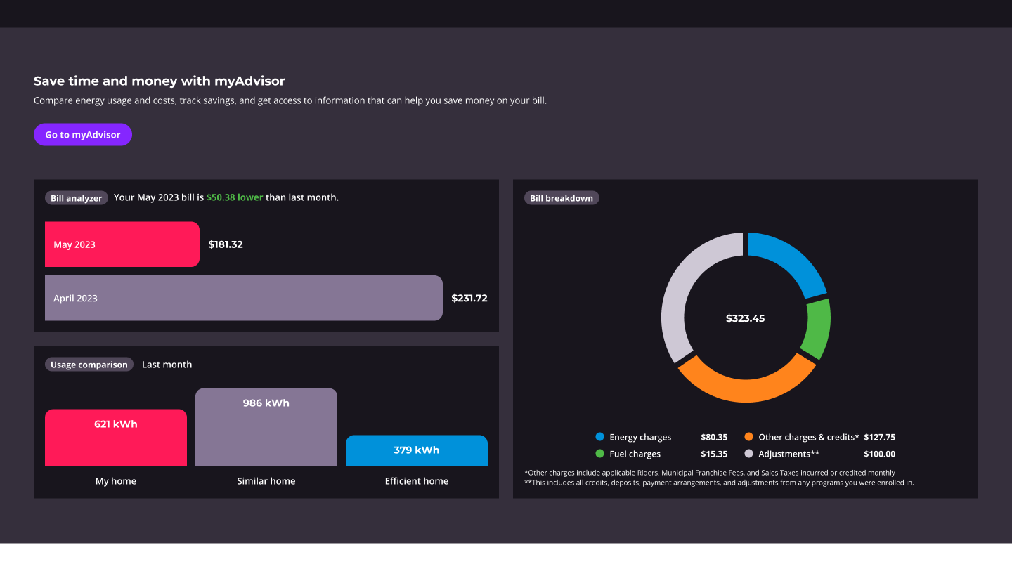
Charts + graphs
-
![]()
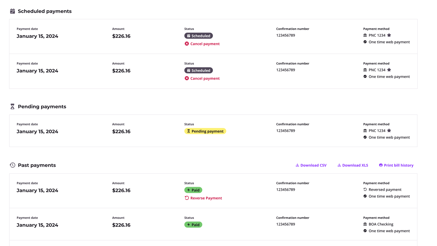
Tables
-
![]()
Stepped workflows
-
![]()
Payments
-
![]()
Side panels
-
![]()
Payment method cards
-
![]()
Forms + selectors
-
![]()
Infographics
-
![]()
Landing page modules
-
![]()
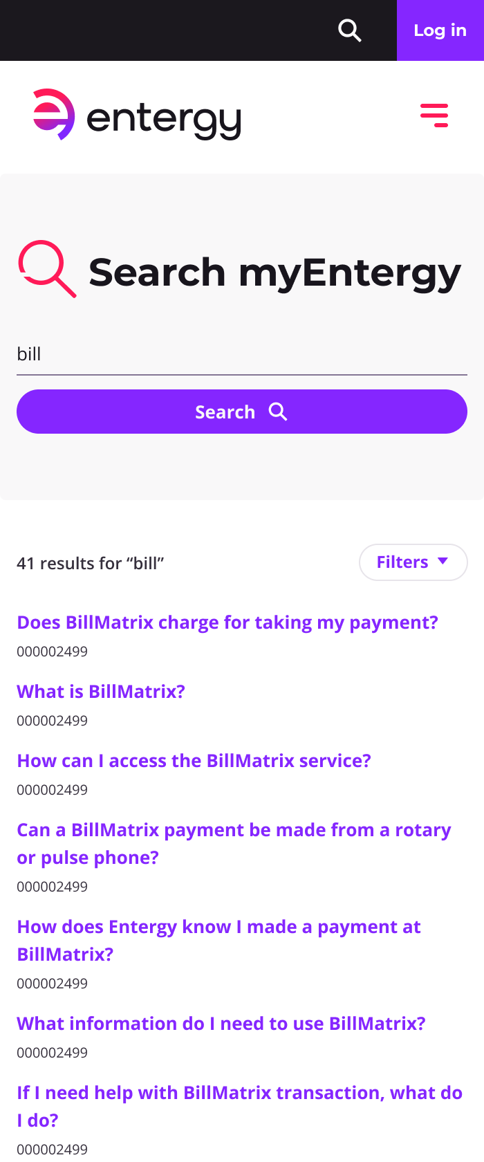
Search
-
![]()
Modals
-
![]()
Alerts + notifications


❇️ Responsive design is responsible design ❇️
I designed every screen at four breakpoints to ensure successful component and layout scaling: extra large + large desktop, tablet, and mobile.


Interactive prototyping is an integral part of my design workflow, and that is especially true for this product. A tangible prototype gives project collaborators a clear expectation of how designs should function.
Check out the video below to see one example of a interactive prototype for Entergy (this is not a developed website, this is a prototype built in Figma). ⬇️

⬆️ This is what prototyping looks like behind the scenes… linking up relevant screens, components, and interaction states to emulate a realistic live experience.
i ❤️ file organization
There’s no shame in a bit of messiness in design work, but that’s never been something I prefer in my workflow. I love keeping my Figma files as organized as possible. I’m not 100% perfect (despite the rumors), but I always have a foundational layer grouping and naming system in place.
At the risk of looking like total nerd, here’s a video of what jumping into one of my page structures would look like.
